Pleo
Dashboard redesign focused on clarity and accessibility.
Project overview
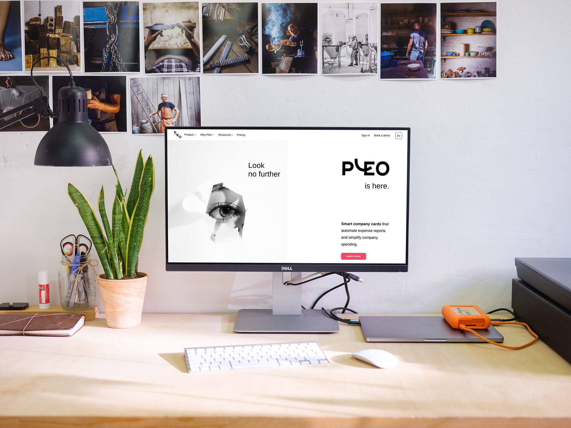
Pleo is a company that produces Pleo company cards that automates expense reports. Pleo has many clients- it is trusted by numerous companies of different sizes and industries. Pleo’s website is used by different people with different needs so it needs to be easy to use and navigate.
Research
This was the project where I as a designer struggled the most. It simply was not something that was close to the projects I’ve done before or the field that was familiar to me. It was a step out of my comfort zone for sure, but also a very useful opportunity to learn. This is why I have had done the most thorough research so far for one project. First, I have looked for some similar companies, that share the industry with Pleo, and I’ve come to a finding that all of them have very similar websites. This is where I’ve decided to “jump out” of the familiar pattern and design something new and different.
Brainstorming, iterating, and brainstorming some more
First ideas:
Design attempts
Attempt 1 Attempt 2 Attempt 3
Design system and Contrast check
Rethinking
After many design attempt I’ve realised that I’ll stay true to my initial design and to a simple solution A clean design with only few colors so that user won’t feel distracted when trying to find information on the site. This is the reason why I made next Moodboard, and by it , Final design.